I am a Doctor-turned-Researcher, R Enthusiast, and a Strong Advocate for Open Science, with nine years of research experience. I am currently serving as a Medical Scientist at the Indian Council of Medical Research. I am a driven and highly organized professional.
First, I received my medical degree (MBBS) in 2010. Then, I pursued my Ph.D. in Clinical Neurosciences at the National Institute of Mental Health and Neuro Sciences (NIMHANS), Bengaluru from 2012-2018. I also served as a Junior and a Senior Resident in the Center for Addiction Medicine, NIMHANS during the same time. Finally, I worked as a Postdoctoral Fellow at the prestigious National Institutes of Health (NIH),USA from 2018-2020. As a postdoc at the NIAAA/NIH, I studied genetic variations in alcohol response and alcohol consumption to understand what drives the addictive processes underlying alcohol use disorder (AUD).
I am an effective communicator skilled in data management, exploratory and confirmatory data analysis. I am also skilled in conducting meta-analyses, testing statistical models, and creating effective data visualizations in R (advanced). I have published several scientific articles and presented them at various conferences. (Link here)
I developed a deep interest in data analysis and visualization when I encountered R and R Studio during my Ph.D. As a non-programmer, R-learning was a steep curve, as one can imagine. But, I persisted. I learned, stumbled, and learned better day by day. Thanks to the open R community, I got answers in some blog or slack channel or another.
Now it is time to pay back. I hope my blog posts (snippets of R learning) would help a “true-beginner” interested in learning and experiencing R and its magic!
Many ask, What can you do in R? Why R?
I ask, what not and why not?
–Soundarya Soundararajan–
Links to some of my works:
Here is a video on genetics and epigenetics of alcohol use disorder I presented for the virtual knowledge network (VKN) in NIMHANS, in 2017.
This greenish-white heatmap I created depicts the number of viewers for my favorite F.R.I.E.N.D.S. series when aired. Colors range from white to green, i.e. increase in the intensity of green depicts more viewers. Can you guess the two consecutive episodes in season 2 that attracted many? I made this for a tidy tuesday project in 2020. I was very delighted to see a heatmap generated from my hands, as this was my first attempt. I also made the codes available here
I believe all excellent works take time. Here is the timeline of my Ph.D. thesis publication. this was accepted and published after several rejections. Nevertheless, I learned a lot, and this challenging process led to this visualization. The timeline is below and the code to produce this is here

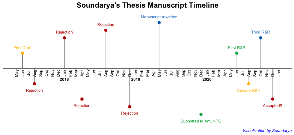
Read my thesis publication here.